Disclaimer

"Some of the products used on my blog may have been provided by the vendors mentioned in my posts."

Monday 28 February 2011

The Best of Times!

As I said earlier, I went to the FANTASTIC event organised by PaperArtsy and LB Crafts.  

I was nervous about whether I would enjoy myself as I was going on my own but I needn't have worried. Everyone was really friendly and there was a great atmosphere.  I met some lovely people which made the day such good fun ... so thank you to all of you!  :) x

Tim was THE BEST.  Really amusing and approachable and very motivational.  We got LOADS of goodies to go into our boxes plus rolls of tissue tape and Ranger goodies. 

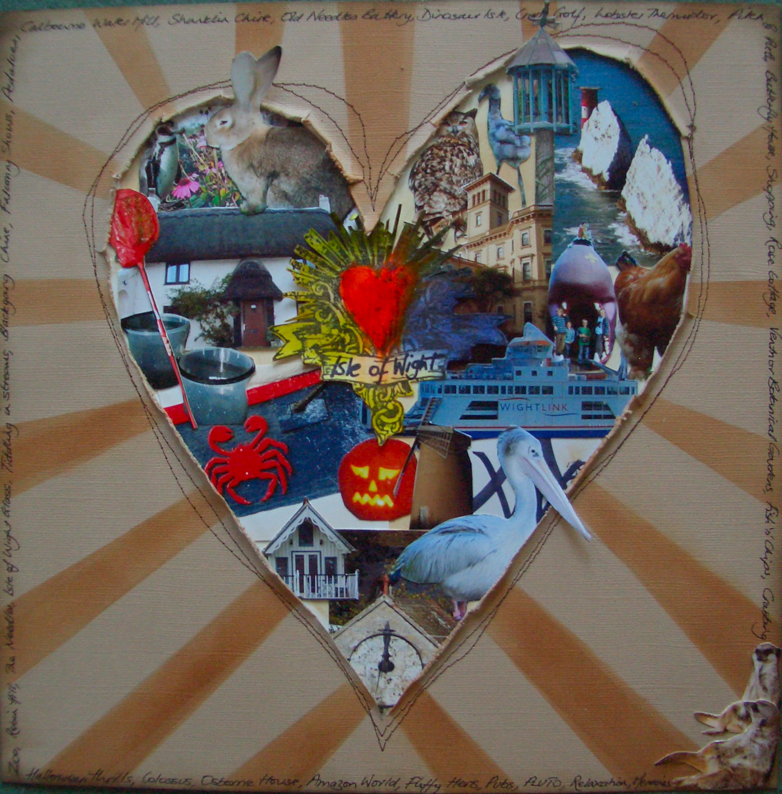
I did the 4 hours with Tim from 8.30am and the time just flew by.  I haven't finished my box (but then neither has Tim) but I will complete it asap and post it.  However, it's shaping up well (I think) so here it is so far ...


It has not feet yet and quite a bit of empty space ... but watch this space as it will be filling up soon!!

After lunch was our class with Lin and Leandra which had been extended from 2 hours to 3 1/2 hours so that we would all have time to complete our project.  How nice of them was that?!!!  

The amount of work they had put in to getting our kits ready was phenominal - all the card was pre-covered with the papers and all had been red line taped for us.  All the EZ Mount was cut (how awful a job was that - BIG THANKS to Karen - u r a STAR!!).  

Girls ... it was SO worth your efforts.  Fantastic project and really enjoyable class.  Only wish I lived nearer so could do more classes with you!!  

So, here it is!!
I loved making this piece and it has inspired me to make more 'things'.  I always scrap as I need to feel that what I make is useful and seeing my family look back through my albums and remember our trips fulfils this need.  However, this project was so enjoyable and looks so lovely that I am going to embrace it and make more items which are just made for the fun of it!!

Play the Game


For this layout, I used glimmer sprays and distress inks to colour the backing paper which I had crumpled up to give it that shabby tattered look.  I stamped clocks and script to add to the effect.  I used sequin film and distress ink to make the honeycomb pattern and mounted my two bees on 3D tape to hover on it.

The clock was a die-cut from my stash which I masked and inked before adding the clock hands.  
I made the fold out tag from cream cardstock and used distress inks and stamps to embellish it before adding the journalling and photographs.  I'm not usually a fan of hidden journalling elements but the story behind the photo was quite long and couldn't easily be told in a flat layout.

I wanted to secure my tag with the fasteners that are found on internal envelopes in large companies but despite much googling, they have eluded me.  If anyone knows where you can get these - please do let me know ;)  Instead, I have used Ideology Hitch Fasteners.   

The title was stamped with dotty letters to reflect the honeycomb and the remainder of the title was stamped onto cotton tape and distressed.  I used staples to grunge them up before fixing them to my layout.

Hope you like the end result.

Enchanted Doorways


Since the photo workshop where we worked on photographing fairies (!!)  my childhood fascination with magical elements has been re-awakened.  The stamps by Lavinia Stamps were perfect for capturing this mood as was the large shroom by Jo Capper-Sandon.  The photo is of a fairy door that I took with me when we visited a local gardens.  It turned out to be really hard to place so that it looked 'real'.  

I stamped the large mushroom and masked it before using colourwash sprays and glimmer mists to create the background.  Once dry, I stamped the other elements.

I'm really pleased with how it has turned out. 

Thanks for looking :)

Butterflies


This layout is a scraplift from a beautiful layout which was at CHA 2011 on the Ranger stand.  I saw a photograph of it on Flickr and it captured me so I did my version of it using the Fanciful Flight Die from Sir Tim.  

I needed two smaller butterflies so I die cut them first then cut them smaller.  I used dimensional paint to create the overlay which is part of the main die.

The bodies of the butterflies are created from the new ideology pen nibs that Tim Holtz launched at CHA 2011.  I did the FANTASTIC class with Sir Tim on Friday (will blog that later LOL)  and we were all give the most AMAZING bag of ideology goodies to fill our configurations box.  However, I had already got this layout ready to go and so I kept the two nibs in our goody bag to use on my page and now just have to wait for them to ship to the UK to give my last butterfly a body  :(

Scilly Isles


I did this layout at a recent retreat I went to with Just Scrapbooking in Cornwall - so credit again to Linda for the original inspiration.

I used Ten Second Studio metal and dies for the dragonfly.  The bird is stamped onto Stampboard and coated in glossy accents.  I used ferro onto heavy cardstock and stamped the alium head into it before rubbing it over with a contrasting colour.

I tore pages from an old book and used Masquepen to highlight some of the words.  Once the masking fluid had dried, the page was inked to bring out the words and I used the alium stamp again on the page edges.  I used hooks and eyes to link both sides of the book together.

This page was great fun to produce- I definitely like the use of the book pages so watch out for them in my other layouts!

Canvas

                                                                                                           I’ve bought a large canvas and have collected together lots of things we found on the beaches of Cornwall. I want to create a mixed media project to bring all the elements together and capture the time we spent beachcombing.  I want to experiment with cutting apertures in the canvas to give the finished piece a very dimensional effect.
I started by laying out the photographs and elements so I can see where to cut the apertures and get a feel for how the canvas will look.
 

I have decided where I want to cut the apertures into the canvas and fixed the windows into place for my layout.  I have applied a layer of gesso to the whole project as a base.  Unfortunately,  I now have to stop this project as the gel mediums and molding paste for the next stage have had to be sourced online.  Why are there no art outlets in Dorset?!! Don’t get me started ...


4 days pass and then my parcel arrives ...


I applied molding paste (Golden) over the entire canvas to give it texture and put more around the apertures to make sure they blended in.  I then used several acrylic washes in three colours which were based on the beach shades in the photos.

When the washes were dry I used a flat brush and slightly diluted acrylic over parts of the canvas to give a watery effect.

 
The sand was created using pumice gel (Golden).

As a final touch to the background, I flicked some colour wash (Adirondack) onto the ‘beachy’ areas to pick up on the texture of the beach in my photos.

Whilst these were all drying, I printed the ammonite shell onto a transparency and cut it out to fit the circular aperture.  I painted the back of the transparency with glass bead gel to give a texture.  As this aperture was created with a tin which has a metal base, it reflects the light through the transparency and makes the glass beads shine.

I used handmade paper as a matt behind the photos and adhered them to the canvas with soft gel (matte).  I adhered all the elements with this gel also.

My title was created on my computer and flipped to read in reverse.  I printed it out and used the soft gel to do an ink transfer of the words onto the canvas.

I really enjoyed doing this piece and I love the finished effect ... hope you do too.

Cyber Crop


To celebrate National Scrapbooking Day, I joined a cybercrop (hosted by Linda @ Justscrapbooking).  From 4pm until midnight everyone scrapped together from various parts of the UK whilst chatting online.  It was really good fun with different people coming and going throughout the session. 


I created this layout based on an advert by Selfridges which Linda had taken from a magazine.  The layout proved quite a challenge, in terms of getting the size of the images right and positioning them correctly in the heart.  Cutting them all out was time consuming but I think the finished result was worth the effort and not a style of layout I would have done had I not taken part in this challenge.

I am definitely a cyber crop convert and enjoyed this challenge.  

Postcard from Paradise


This is probably my favourite layout at the moment.  I always love everything connected to the sea and the beach and so I had the ultimate fun creating a layout to do justice to the fabulous photograph.

You may have guessed from looking at some of my other layouts, that this picture was taken in the Isles of Scilly.  I wanted a really beachy feel to the layout so I started by creating my own background paper using glimmer mists, colour wash and acrylic paint.


 I built up the corner of the page with Golden Coarse Pumice Gel.  It took several layers before I achieved the result I wanted and I inlaid some small stones and shells in the last layer.


I stamped the grasses in two colours to represent the grasses in the dunes.

The fence was cut using the ‘On the Fence’ alterations die.  I cut it from a piece of Heidi Swap invisibles paper which I then inked using distress inks in beach shades.

I matted the photograph onto a Chocolate core paper which I lightly sanded to distress it and expose the yellow core.

I printed the seagulls onto acetate and set them in the corner of the page.  The postcard and title letters were stamped onto another sheet of handmade paper created in the same way as my 12 x 12 paper.  I mounted the title letters on 3D tape so they are almost floating on the page.  The stamp was from the Tattered Angels beach stamps set which I inked with distress ink.  I attached a cornish metal starfish charm to finish this area of the layout.

I found some beach clipart online and downloaded it and re-sized it to a tiny size so that I could print it onto the back of a piece of Idealogy Film Strip which I then attached to the page using glossy accents.

The last part was the journalling, which I wrote by hand along the bottom.

On the Boardwalk


This photograph was taken in the Isles of Scilly which is a hidden gem of the British Isles.  So beautiful, the scenery takes your breath away.  Around every corner is the most idyllic and photographic scenes imaginable which are going to provide me with endless pages.  The only problem is doing justice to the pictures!

The back paper is by Graphic 45 and onto that I have layered two further pieces of paper, both of which are torn and rolled to give depth.  The paper onto which the photograph is layered has been embossed with cogs and sanded.  A page from Alice in Wonderland (entitled ‘The Looking Glass’) has been inked and stamped with shells.  I used frosted memory glass over the shells are sprinkled sand and shells.  Some hessian, a tag and a key finish the layout.

My thanks to Linda (justscrapbooking.co.uk) for the initial inspiration behind this layout.

Love Cupcakes


My best friend makes the most fabulous wedding and birthday cakes so for my birthday, she made me a cake for one!  It was so lovely, it deserved to be scrapped and so before I indulged in eating it, I played with the camera to get some fun shots.

The red on the paper matched the colour on the cake perfectly and the sentiment was ideal.  I used my Prima Build a Frame stamps to create complete or partial frames around the photos.  I backed one of the pictures onto old sheet music -  I love using old music on my layouts but I also liked the connection with this page as it really lifts you and makes your heart sing when someone takes time to make you a gift.  I inked the edge using distress inks before adding a little red glitter to highlight it.

The tag was already printed but I added thread, filmstrip and glitter ribbon to lift it more and co-ordinate it with my page.  I stamped the May Memories tag and distressed it with distress inks.  I stamped the small date frame and painted it with glimmer glam to give it a little sparkle.

Layout complete!

Weave


This is a layout showing all the webs in the garden of a cottage we rent in October each year.  They were so beautiful - covered in dew and glistening in the morning sun.  Autumn is such a lovely time of year.

The paper is from a Halloween series by Pink Paislee but was perfect for the photos.

I gutted the paper and re-mounted it onto a dark brown backing sheet using 3D tape for the new frame.  I used alcohol inks for the Bo Bunny Clear Frame and I mounted the two smaller photos onto gold mesh.

The birds, nest and birdcage were stamped and cut.  The title was cut twice on my Cricut.  The metal flower was made using Ten Second Studio metal which I inked with alcohol ink and stamped with Staz-On using the TSS matching stamps.  I cut and curled the layers and finished it with a jewel brad.

Love


I took these photos of two of my sons and they absolutely capture the relationship between them.  I knew that I wanted to create a page based on them and as there were several good shots in the series, I hit upon the idea of the oversized filmstrip.

However, when I created the strip, it just didn’t work and so my idea had not translated onto the page.  I fiddled with it for ages before I decided that what was lacking was the little square punched holes in the sides that filmstrip has.  However, I don’t possess a small square punch so it was back to the drawing board.

I left the filmstrip and created the metal ‘Love’ embellishment using Ten Second Studio tools and plates.  Once this was done, the layout started to take shape. 

My original idea had been to leave part of the filmstrip blank as if it were a piece of a length of filmstrip but as this didn’t look right, I extended it to go across the whole page and put pictures in all the apertures.

I inked the edge of paper with distress ink and used a rub-on to capture the mood of the pictures.

A funky arrow and a line of journalling completed the page - Phew!

This layout has far less steps than many I do but it has taken me ages to complete as I got stuck in how to transfer my idea to the paper.  Just goes to show that you should always persevere!

Sunday 27 February 2011

Call Me Bruce


I created another dimensional layout following on from how well my boardwalk layout turned out.

I wanted to created a window through which our lovely llama was peeking and by rolling back the paper, I think I achieved this.

The tree was created with a punch.  The birds were cut on my Cricut machine.  The tag was made with distress inks and some of the Tim Holtz stamps and I stitched each corner of the page with embroidery silk to add interest.

Halloween


I got the Halloween bug and when I found this paper in my stash (Rusty Pickle), I had to use it.

Strangely however, the thing I struggled with was that the paper was so lovely, I didn’t want to cover it up so I found balancing the layout with the paper quite a challenge.

I love filmstrip and the Tim Holtz die is great.  I cut and inked the filmstrip and used the same photo in all the apertures.  The picture was one taken of a sunset by my son and I used picnik again to add the lightening and make it halloweeny.


I cut the birdcage and bats on the Big Shot and used glossy accents to glaze the bats.  I dipped plain brads in glue and then in black glitter and put them into the holes in my ‘batcage’.  I used three skull charms to make it more eerie and fixed my flapping bats inside the cage.

The halloween words were cut from another sheet of halloween paper I had by Rusty Pickle.  I used a photo of our pumpkin when lit in the dark and fixed an acetate over the photo which picked up the orange in my layout.

I wrote the title and journalling and embellished it with an orange stickle.

Witching Hour


We carved such a great pumpkin this year that I made it my mission to do some halloween layouts to keep a record of it.  It was the last pumpkin for sale in a garden we passed in the Isle of Wight and it was MASSIVE.  It looked awesome when it was finished, especially when it was lit in the dark.

I used Tim Holtz alterations die to create the sign (which hangs on chain so it moves).  I used metallic rub ons to make it more metal-like.  The sign has cobweb under the lettering.  The bats were also from a Tim Holtz die.

I used picnik software online to change my picture and make it more scary and also add cobwebs to it which are quite subtle.

I added the tied tags at the bottom which are embellished with a glittery spider and diamond glaze to highlight the pumpkin.  They are held together with string wound around two enamel brads.

The journalling is hidden inside the acetate pocket which has a time wording and theme to match with the clocks I stamped on the background.

The layout was finished with ribbon and a small skull and crossbones charm. 

I am really pleased with my first halloween layout.  So much so, I did another one!!

Valentines Card


This was the card I made for Valentines Day.  Cards for men are the hardest as so many elements are just not appropriate for them.  Butterflies and flowers are out birds and hearts need careful use if they are not going to look frilly. 

I based my card on the heart stamp and worked it back from there.  I used distress inks to colour the background onto which I then stamped the script and the frame elements. 

I used the Tim Holtz wing stamp which I cut and inked to add to the heart stamp.  I wanted to add my message to the front of the card without it taking over from the design and so I created it using miniature alphabet stamps.

I’m really pleased with the end result.  Hope you like it too.