Disclaimer

"Some of the products used on my blog may have been provided by the vendors mentioned in my posts."

Friday 2 May 2014

The Cloisters


As part of the kit that Scrapbook Magazine supplied to me, there was a sheet of these clever frames which really do appear to be 3 dimensional.

I had lots of photos of an Abbey we visited last year in France and I thought these would lend themselves very well to a traditional feel.  I decided to create my background as a wall onto which my pictures could hang.

I cut strips of paper from the kit and fixed them along with some lace to the background.  
Once dry, I added lots of texture paste through a word stencil and a brick stencil.  Once the paste was dry, I used paints and inks to blend everything whilst adding in my accent colour of purple to pick up on the lovely lavender that was planted in abundance in the Abbey gardens.  A little stamping of various images and some evocative words placed strategically here and there gave more interest.


The key and pen nib were treated to a little acrylic paint and I added some crackle paint to the metal frame nib frame for a rustic feel.


I finished the page with some dusty attic music, painted black, a vintage watch face and a couple of butterflies ... oh and the lovely angel wing.


This layout is a total departure from my usual style but when you are given a kit and a specific remit, it pushes you to find a new creative path.

I hope you like this layout and thanks for visiting to take a look.

xx


Tuesday 29 April 2014

Reeva


This was my second layout for Scrapbook Magazine using Dekromounts and featuring our new baby.

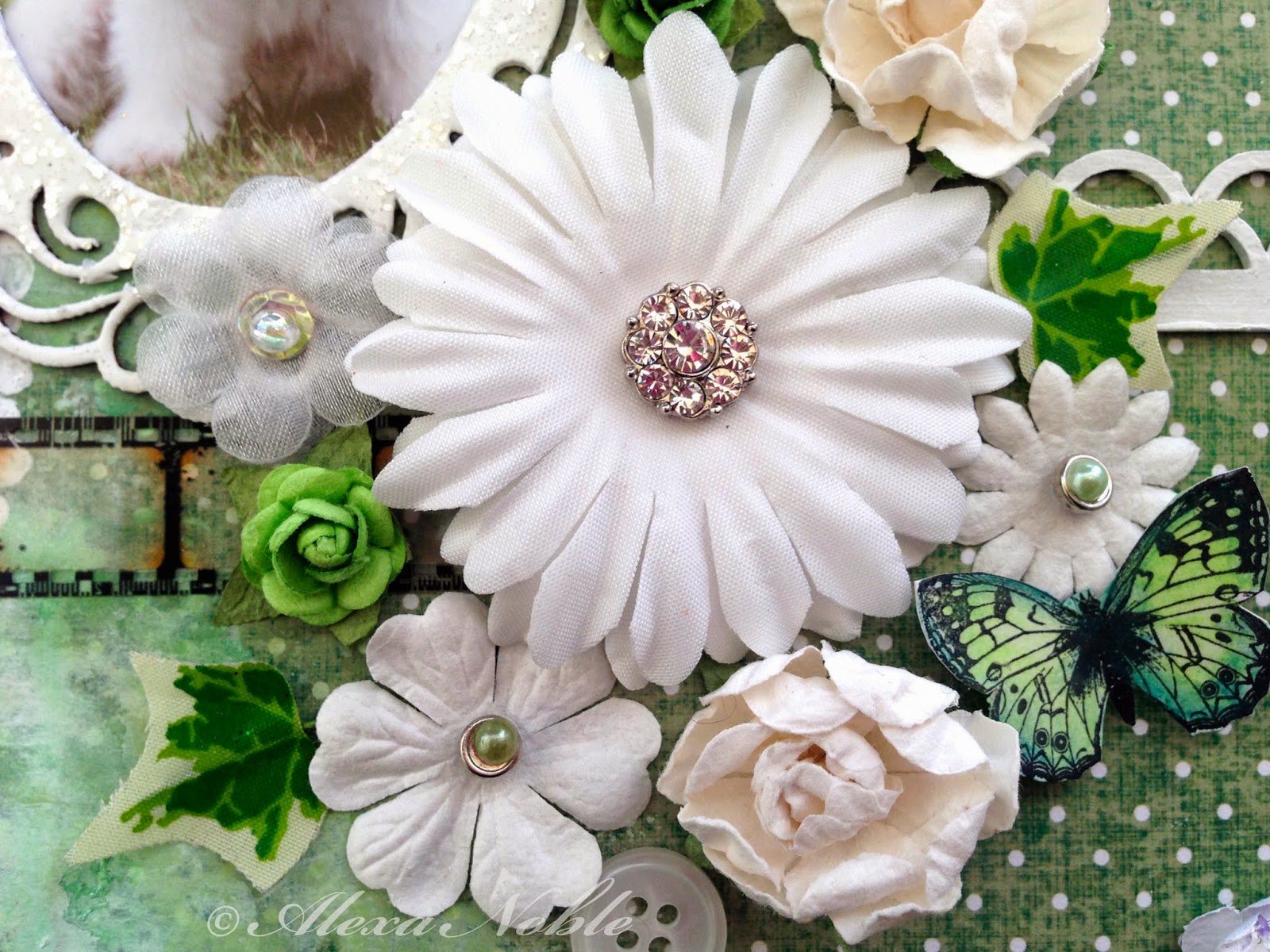
I embossed this frame with white power to which I sprinkled Frantage Glass Glitter for a good dollop of sparkle!

I added the Damask textures with a stencil and molding paste to which I then added some fabric in the edge and plenty of paints and inks, splats and more stencilling.
The title was hand cut, as were the butterflies which are by Lost Coast Designs.


I had the white sprig sitting in my stash for sometime and I knew it would come into it's own at some point.  It works really well on this page, coupled with the other white elements and the butterflies.


I clustered my blooms and added a little filmstrip and chipboard decorative strip for balance against the frame.  I used one of my special diamond brads on my main flower to tie in with the glittery frame.  The flowers are from a variety of manufacturers - I love Prima but they are not the cheapest so I always try to combine some less expensive options into the mix.  The little wired ivy leaves are really cost effective and add lovely colour and interest.


Thank you for stopping by ...

xx


Sunday 27 April 2014

Beach Day


Hi Everyone!  Not sure how many people will read these latest posts as I'm sure a lot of you have given up on me posting any new projects but here goes anyway!!

I am really pleased with how this page cam together and even more pleased that Scrapbook Magazine decided to use it on their front cover!  That certainly brought a big smile to my face!  I've yet to make the main image on the cover ... but that gives me something to aim for.

This project features Dekromounts which are really sturdy mounds for card and scrapbook pages. They are plain cream and can be sanded, painted, embossed, inked etc and so are good fun to work with.  I was given a kit by Scrapbook Magazine and so for this layout it gently inked the edges in victorian velvet DI and them mounted it onto the corresponding back plate which I had covered with Autumn Gold gilding flakes.

I stitched some of the other papers in the kit to my background  before using white acrylic paint and a Tim Holtz burlap stencil to add texture. I added some greens and pinks using gelatoes which I blended with my finger to finish the background.


I filled a small bottle with some same and small shells before adding my message in a bottle, tied with natural twine.

I love prima flowers as they alway sit so well on the page and their colours are always beautiful.  I used them, coupled with some Petallo plains to frame my bottle, along with curly wire stems for my blooms.


I inked up the beach day checklist to match my layout and created my postcard stamps and ink.  The journalling was created using my lovely pink typewriter (which makes me smile ever time I get it out).

The text reads:

After the storm subsides and the waves no longer crash onto the beach
Treasures of the deep which are normally hidden, lie uncovered on the sand.
A spiral castle of green, pink and gold gleams in the white foam
I capture it's beauty before returning it to the depths of the ocean where it belongs.

The story behind the photo is that I was walking on the beach in the winter sunshine on the day after the big storms we had this winter.  I saw this beautiful shell sat on the edge of the sand where the water was lapping.  Most of these type of shells on the beach are just plain cream in colour as they are empty but this one still had the animal inside and the colours on it were just amazing.  I would love to have a shell like this in my collection, but I have to wait to find one which is empty. 


This lovely metal starfish has been in my stash for ages as I can't replace it and it's so realistic. I thought this project justified using it and so it now sits proudly on display rather than hiding in my drawer. 

Thank you for visiting today ... 

xx


Wednesday 22 January 2014


I love this photo of the boys and this was them together on their Birthday giving each other a thankyou hug after they had exchanged gifts.

... which brings me to TioT's challenge for the next fortnight ... Celebrations!

So this was my interpretation of the subject and it shows just how wide the category is.  I don't know about you, but personally, I like to have a fairly free rein to do my own thing so don't feel limited!

I started my page by masking the stars which were on the paper (I used to pull-off tops from new paint pots as my masks) and them stamping the crackle and text.  I spritzed the paper to fade from blue in the top left corner to gold in the bottom right corner.  You can't really see all this detail in the image so you'll have to trust me on this one!!

I mixed some moulding paste and made gave the stars some dimension using a handcut stencil from tracing paper.  I then used the edge of a Wendy Vicchi stamp as a template for my scallopped painted corder.

The photo was blended in with acrlic paints and overstamped with text before adding some of those lovely rub-ons from Sir Tim.  The tag started life on a gardmen but a bit of paint and some rub ons converted it to match my scheme.  

This layout was fun to put together and cost next to nothing (which is always a benefit!)

Hope you all feel like celebrating with us in this challenge and look forward to seeing all your lovely creations.

xx


Thursday 9 January 2014

New Mask


Let me start by wishing you all a very Happy New Year!! I hope your weather is being kind or at least not as disastrous as it is for some poor souls.  Here on the South Coast of the UK we are being heavily lashed with floods, fallen trees and high winds.  Our beach has been moved by the wind and seas up onto the promenade and the sand is now so high that the wheelie bins have disappeared (so that must be over 4' high!!)

So onto our first challenge of 2014 for TioT which is very apt - 'In with the New'.   What this challenge is all about is showing something new - a technique, a new stash item or something Santa left if your stocking.  It's entirely up to you - how fun this that?!!  Just be sure to tell us what your new item is in your blog entry.

So what's new in my layout?  

I created this page using a masking technique.  I had the idea from this wallpaper which we recently used in a show home and I decided to recreate it on my page using a very low tack masking tape.  I used frog tape (available at Homebase and similar).  It's quite expensive compared to masking tape but I always find that masking tape damages the paper whereas Frog doesn't.


I started by creating my wood mask. 


The I painted the sections in with acrylic paints.   You need paints that dry matte for the best effect and these include many of the inexpensive brands (mine are Docraft Artiste paints).  Be sue to get a dark outline at the edge of each plank so that they are clearly separated once the tape is removed.


Once you have completed the whole sheet, remove the tape and put it back over the painted planks and do the same again for these areas.


Remove all the tape and voila! you have your scrapwood background paper.


I look forward to seeing your 'New' creations.  There is plenty of inspiration for this challenge from my other DT friends, so why not pop over to Try it on Tuesday Blog and see if you fancy joining in the fun?!

Take Care and Keep Safe.

X