Disclaimer

"Some of the products used on my blog may have been provided by the vendors mentioned in my posts."

Thursday, 31 March 2011

Soooo Excited!!!!!!


I've had to keep this quiet until today ... but I can now officially annouce that I have made it onto the Gingersnaps Design Team as a Contributing Artist.  Soooo Excited ... just can't tell you!! 

This photo frame is my Gingery Creation for the announcement of the new members of the team.  I am so pleased with it - just need to find a great halloween picture to display in the centre.

If you haven't taken a peek at the Gingersnaps Blog, why not pop over.  There are lots of tutorials and challenges to get involved with, not to mention inspirational work to get your creativity flowing.

Look forward to seeing you there! :)

Wish

I made this to meet the challenge for the April art swap run by Craft Stamper magazine.  The theme is Fun and Games.  It colour scheme is olive, rust and cream and up to 5" square and include a game piece.

I had lots of fun doing this project and used loads of different techniques to get the result I wanted.  The initial background was created on glossy paper with alcohol inks and I then painted half the page with Antique Linen distress crackle paint.  Once this was dry I used pastels to colour it and then sheet metal and distress embossing powder in small areas.

I stamped the windmill and used distress embossing powder on the spinner before attaching the scrabble pieces on the windmills sails.  Complete and ready to mail ...

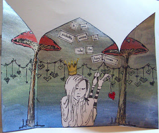
Stealing the Fairy's Crown


I have created this Triptych card for the Stampotique Designers Challenge.  To say that I agonised over it would be an understatement.  The rules of the challenge this week only allow the use of Stampotique stamps and I found it really tough to get any theme. 

Some hours later (having distractedly driven the children about whilst still trying to work out how to meet the challenge), I came up with my design (sorry kids!!).  

I used Artquest paints which are available in wonderful duo and interference palettes as well as pearlescent and metallic.  They blend beautifully and are affected by the colour of the paper you use them on.  However, as they are so soft, they are tricky to work on top of without marking the finish you have created.

I hope the end result captures the fairy world of glimmer and shimmer I was hoping to achieve.


Friday, 25 March 2011

Worker Bee


This card is for the Gingersnap Creations GC93:  Chestnut Challenge - Get To Work.

I watch all the wildlife in my garden as I work and bees are always at work too so they seemed a good starting point.  As I began this  project, the sun was shining and my window was open and a big fat bumblebee buzzed in on his travels so it sealed my idea.

I stamped the background with a honeycomb pattern and inked the edge with distress ink.  The flowers were stamped with VersaMagic chalk inks to give a really soft finish.  The bees are Stampotique  and the large bee is 3D mounted for depth. I painted the wings with rock candy and a little bit of sparkle.

I fixed the title into a metal plate and stamped the works in amongst the blooms.  The task for the bees is the make honey, unfortunately, for most of us, it's to make money!!

Wednesday, 23 March 2011

Hare


This is a quick thankyou card made for a good friend of mine. I only had 20 mins to put it together and I'm really pleased with the outcome.

The stamp is by Crafty Individuals and I stamped it onto gloss paper twice and cut the hare out of one.  I coloured some of the areas with alcohol inks and 3D mounted the hare.

I matted the image onto two contrasting papers (patterned one by Black Market Paper Society) and stamped the backing card with a bare tree that was by Graphicus.

Job Done! 

Tuesday, 22 March 2011

Blue


How I love to mess with inks and mediums!  I created the background for this card using Shimmerz sprays which I built up in layers and dried off each time with a heat gun.

I used various items around my desk to create patterns on the background using acrylic paint and then I infilled two of the circles with glass bead gel medium which is a fantastic product as it dries clear and leaves the most fantastic dimensional effect created with minute glass beads.

Moth Fab is a Stampotique stamp and I coloured her with alcohol inks before mounting her onto the background.  The title strips were printed from my computer and edged with white caligraphy ink and a black sharpie pen.

I mounted the finished piece onto a plain card which I stamped with script in Chipped Sapphire and distressed with a little Victorian Velvet.


Monday, 21 March 2011

Tick Tock


I've created this card for the Stampotique Designers Challenge which is to create a piece  which includes an animal stamp.  Not sure if a fictional White Rabbit meets the brief but I'm about to find out!
I started by stamping and clear embossing the clock before creating the background using Adirondack inks and a brayer.  Once I was happy with the background, I ironed off the embossing to give a faux bleach result.

The stamps are all by Lavinia Stamps and I built up the scene with various images, using parts of the stamps where necessary.  The rabbit is stamped onto gloss paper and coloured with alcohol inks.  His watch is highlighted with a gold stickle (hard to see on screen!).   
The background card was coloured with distress ink and over stamped with script.  I splashed colourwash in cranberry randomly and then edged the paper with rusty hinge distress.  The final step was to edge the card again with a gold leafing pen.


Thursday, 17 March 2011

Bags of Style


I had an idea to make a patchwork element from the leftover squares which were snipped out of all the pre-folded papers I used to infill the configurations box.  I glued them all randomly and gave them a coat of croco basecoat and the end result was really pleasing.  This was where the fun began as I felt as if I was in free fall after that, trying to get the layout to work!  

I needed the right sort of image to go with the paper so I decided on some of my daughter after an evening at guides making an outfit from old bags and images from magazines.  The  colours and grunge feeling seemed to match, particularly in their original format with our wooden front door as a backdrop.  However, as the day progressed, ideas kept changing the style of the page;  I decided to cut her out, stamp the background and dress the dummy with relevant newspaper clippings.  I added a metal ruler, a corrugated cardboard heart, buttons and a newpaper rosette flower.

As a result, I don't think the page is typical of my usual style and I keep looking at it to make sure it works.  Anyway, it's done now and I hope you like it  :)

Tuesday, 15 March 2011

Step Back in Time


The Prima Botanicals papers are just lovely and so flexible as they feature cogs, birds, insects and scrolls as well as flowers.  They can easily be used for vintage layouts and this picture of the Old Post Office in Tintagel needed an aged feel.

I printed the photograph onto acetate and then selected various other shots from our visit.  I converted some into black and white before arranging them on the page.

I used Ten Second Studio metal to create the time plaque and an old clock face to emphasise my theme.  The buttons were made by pouring UTEE into a mould with a circular button of time themed ephemera at the bottom.

The wording at the top was mounted onto old sheet music which had been coated with Croco Base Coat.

Spring Time

This is my second layout of the weekend.  Here I used masks, ink sprays and Ten Second Studio metal.  The glorious foxgloves were captured last Easter at Tintagel.  I used a melt pot to coat the clock and the birds and give then a high gloss finish.

The bird is by Prima.  I have inked it a little and drawn its legs so that it sits on the masked image of barbed wire.  The acetate postcard was made with a Crafty Individuals stamp.

The title letters are a combination of stamped and inked for the word Spring and the new Ideology Alphaparts for Time.

Really had fun creating a layout to show off this image and I love the result.

Spring


This is the first of two layouts I completed at the weekend.  I went to St Ives in Cornwall and spent Saturday with Just Scrapbooking.  I love being able to play with so many different materials and the best bit is having a whole day to indulge in my favourite activity without having to break off to prepare lunch or help with homework!  Also met a bunch of lovely ladies which I hope I will meet up with again.

I took the photo of the children in amongst the daffodils in a Trevarno Gardens last year.  There were so many varieties and they were all busy with their cameras and videos.  I have aged the picture which gives is a nostalgic feeling.

The layout incorporated lots of techniques including using Ten Second Studio alpha set and metal, ferro paints, water colours and stamps.

I used 'Jasmine' and daisies by Jo Capper-Sandon along the bottom of the page.  The background paper is from the new Botanicals range by Prima.

Wednesday, 9 March 2011

Full Nest


Apologies for the quality of the image.  Due to it being enclosed in a glass fronted box, I have struggled to get a photograph which does not have a reflection of me in front of it!!  I'll see if I can get a better picture but in the meantime, here is the best shot so far.

I converted photographs of the children into black and white and then re-colourised their eyes and blushed their cheek digitally.  I stamped the crowns onto foil card and cut them out before rolling them around a pencil to give then a 3D shape.

The clothes were cut from felt and embellished with lace and the feet were cut from a stamp of children's feet which I stamped onto photo paper.

I painted the inside of the box with Ferro Terracotta and heated it to make it bubble like old paintwork.  I painted the eggs with acrylic paint and painted the speckles on them.

The background was painted with acrylic paint and them I used burnt sienna on my finger to add texture.  I painted the wire stamp with dark brown acrylic and stamped it across one corner.

The bird is stamped from a crafty individuals stamp and coloured with pastel pencils.

This piece was a lot of fun to create and the children love it so it was worth the time! 

Well Behaved ... I think not!


A card for a good friend of mine using Stampotique Moth Fab stamp which is a one of my new acquisitions (it's scary how much craft stuff I NEED!!) I used pastel pencils to colour the tree stamp (Crafty Individuals) and also to colour the edge of the paper to blend it into the backing paper.  I stamped the black paper using versamark which I then used micro pigment paint to colour.

I'm pleased with the result and hope the recipient will be too ...