Disclaimer

"Some of the products used on my blog may have been provided by the vendors mentioned in my posts."
Showing posts with label Prima. Show all posts

Friday, 2 May 2014

The Cloisters


As part of the kit that Scrapbook Magazine supplied to me, there was a sheet of these clever frames which really do appear to be 3 dimensional.

I had lots of photos of an Abbey we visited last year in France and I thought these would lend themselves very well to a traditional feel.  I decided to create my background as a wall onto which my pictures could hang.

I cut strips of paper from the kit and fixed them along with some lace to the background.  
Once dry, I added lots of texture paste through a word stencil and a brick stencil.  Once the paste was dry, I used paints and inks to blend everything whilst adding in my accent colour of purple to pick up on the lovely lavender that was planted in abundance in the Abbey gardens.  A little stamping of various images and some evocative words placed strategically here and there gave more interest.


The key and pen nib were treated to a little acrylic paint and I added some crackle paint to the metal frame nib frame for a rustic feel.


I finished the page with some dusty attic music, painted black, a vintage watch face and a couple of butterflies ... oh and the lovely angel wing.


This layout is a total departure from my usual style but when you are given a kit and a specific remit, it pushes you to find a new creative path.

I hope you like this layout and thanks for visiting to take a look.

xx


Tuesday, 29 April 2014

Reeva


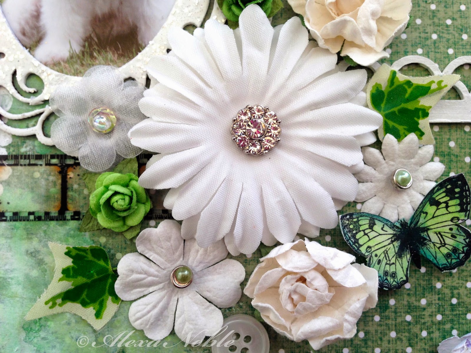
This was my second layout for Scrapbook Magazine using Dekromounts and featuring our new baby.

I embossed this frame with white power to which I sprinkled Frantage Glass Glitter for a good dollop of sparkle!

I added the Damask textures with a stencil and molding paste to which I then added some fabric in the edge and plenty of paints and inks, splats and more stencilling.
The title was hand cut, as were the butterflies which are by Lost Coast Designs.


I had the white sprig sitting in my stash for sometime and I knew it would come into it's own at some point.  It works really well on this page, coupled with the other white elements and the butterflies.


I clustered my blooms and added a little filmstrip and chipboard decorative strip for balance against the frame.  I used one of my special diamond brads on my main flower to tie in with the glittery frame.  The flowers are from a variety of manufacturers - I love Prima but they are not the cheapest so I always try to combine some less expensive options into the mix.  The little wired ivy leaves are really cost effective and add lovely colour and interest.


Thank you for stopping by ...

xx


Tuesday, 8 October 2013

Older & Wiser


I just love this cat - he's such a cool boy (all 14lbs of him!) - so I had to show him off with a page of his own!!

And the TioT challenge launched today is Textures!  Oh my goodness - this challenge was made for me as I LOVE textures of all sorts (I'm not fussy!!) Lumpy, bumpy, stripy, spotty, crackled or crazed - they are all my kinda thing!!

And, not only is this challenge super fun but there's a $10 prize for our winning entry to spend with Smeared Ink.  They have loads of great images to choose from and a rubber stamp club so it's a great prize if you get your textures rockin'!!

This layout was all about my lovely boy growing up.  He's a 8 years old and has put up with many changes throughout his years.  He has lost close companions and put up with unwelcome additions to our family and throughout he has always been a kind and tolerant boy.  With his size, he could easily hurt smaller pets, but he always takes the quiet option and simply observes or turns away from confrontation.  He is a King amongst cats and we respect him for his lovely nature.

So, onto the page ...

I used a doily on the side of the page for my first texture.  I painted it with gesso and them used molding paste and a circular stencil to create the panel for the baby photos. The frame stamp around the photos and in the top corner is by Prima.


I used gauze bandage, which is a great and inexpensive way to add fabric texture to a project, along the bottom of my page, which I painted with acrylic paint.  Small dots from a white paint pen, outlined in black, add more interest as do the few extra dots from the stencil.


I clustered up the lovely Prima blooms with a vintage watch face and a Prima metal plate.  The large flower was stamped and embossed in silver with some glass glitter in lavender added using glossy accents.  I finished the layout with funky fibres and a metal photo corner which I painted with white acrylic paint.


This layout was so much fun and came together without my usual angst (a rarity!)  I hope you get chance to pop by my other DT pals' creations as they are all inspirational.  So crack open your textures and get those creative juices flowing!  The $10 prize is only a texture away!!

Have a great week ...

x


Tuesday, 10 September 2013

Flowers


This fortnight we are concentrating on handmade flowers at TioT and the challenge is Make Your Own Flowers.

I love experimenting and I decided I wanted to make some loose blooms.  I used tissue paper and fine net to create these which remind me of those lovely dark fuschia blooms I had all summer in my tubs. If you crouch down and look up into the bloom, this is almost what you see!

I wanted to use the Fairy Rhymes stack by Prima as it's so lovely and I tasked myself to create a layout using the many elements that come in the stack 'kit'.  This is not something I normally do as I like to start with a blank canvas and create everything myself, so this was also something to add to my challenge.

I think this is why I love this crafting journey.

I hope you will feel inspired to join in with this challenge - why not try to do something outside your comfort zone?  Either way, I look forward to seeing all your lovely blooms ...

Have a great week

x


Tuesday, 7 May 2013

Butterfly Card


This fortnight's challenge at Try it on Tuesday is Feminine & Fancy.   

I  spent quite a lot of time thinking about this one and how I would interpret it but now that Spring appears to have finally arrived, my thoughts are definitely with outdoors and spring flowers so I decided this would be my take.

Talking of Spring ... slightly irrelevant to the post ... but has anyone noticed how blue the sky is this year.  It is amazing - just SO blue it's almost violet.  


Anyway, back to my project!  


I used a sheet of Rue 88 by Prima for my background, over which I stamped and white embossed text from the Papillon stamp set. 


I cut my banner and used a scallop punch for the edge before stamping it with some vines.  The central area was stamped with the lovely dog roses and cut out.


I tinted the background with a diluted lemon gelato to soften the paper tone.


All the stamped images with watercolour pencils which are one of my current favourite things!  I have had them for ever in my draw and hadn't realised just how great they are to use and how they give such a soft but controlled effect.  I finished off with some diamond glaze on two of the blooms.  All these stamps were by Prima's Build-a-Frame set.


The butterflies (Unity)  & bee (Stampotique) were also coloured with watercolour pencils.  I attached them with 3D silicone glue for some dimension.


Hope you are feeling inspired to join in with the fun now that we are getting our daily dose Vitamin D from that lovely sunshine!!

I am also entering this into the Faber-Castell Mou Challenge  as they want something inspired by gardens and the Anything Goes challenge at Our Creative Corner. 

xx

Wednesday, 14 November 2012

Corrugated Page


I'm just back from a lovely scrapbooking weekend in Devon. I love the creative atmosphere that is generated when people all come together, as my art is usually such a solitary activity.  I also cherish being able to craft for as long as you want without having to stop and make meals or do the laundry!!  What a luxury!

We were concentrating on using game pieces and so this layout features large jigsaw pieces.  I used these pieces to link into the photos I had taken of two of my boys who often fall into step together when we are out for family walks.

I started by using acrylic paints on my card and then I used shabby ivory embossing enamel on the opposite corners and embedded  Frantage gilded micra fragments whilst it was still hot.

The jigsaw pieces were covered with old dictionary paper and an old map which I then distressed and stamped onto.  The boys' initials were cut from a vintage pictorial alphabet book.  The little metal number was tinted with pesto acohol ink, as was the small sprocket.

I stamped the sentiment using individual alphabet stamps from 4 different packs onto some Kraft Resist paper which I then distressed with Shabby Shutters.  A few more cogs and sprockets and one of Prima's gorgeous lightbulbs completed the layout.

Hope you are having a good week ... thanks for stopping by! x


Tuesday, 15 May 2012

Play


Everyone loves dandelions clocks as they are just irrestible - sitting in meadows with their large fluffy heads arranged in a perfect ball just waiting to be picked and blown into the wind!


I took this photo last year and love the way I managed to capture the individual seeds blowing in the breeze.


This page was created using tissue, lace, old music, old napkins and stamps all fused together with bondaweb.  I made a large panel and as it had several layers, I did need to use some gel medium to fix some of the elements together.  I stamped butterflies and alium heads randomly onto my panel and added a little tissue tape here and there.


Once it was all dry, I stitched is using metallic thread in the sewing machine onto my background paper.  Metallic thread is gorgeous but can be a bit of a challenge to sew with due to the metal elements in the thread so be warned - you need patience!!


I used a zig-zag thread pattern and I held the paper still in the machine at some points to create more interest in the stitching.


I layered my photo onto a page from an old children's book and popped a small doily behind before added a large prima diamond and pearl embellishment.  I extended the embellishment by cutting sections from another diamond swirl so it covered most of the page height.


I grouped my old clock face and fairy girl in one corner with my sentiment, and the layout was finished. 

x


The Lost Gardens of Heligan


On the way down to St Ives, I met with my good friend Sue in St Agnes to drop into the one and only scrapbook shop that exists in Cornwall (sorry Linda - we did pop in!!)

Anyway, I bought this paper which is actually black and white and which reminded me of the blooms in this photo.  I had intended to use the paper 'bare' as it were, with just black and white additions but as you can see, this didn't really end up happening and I actually prefer it now!

I started by creating a black and white panel consisting of torn music tissue, lace, old music sheets and book pages and old sewing pattern tissue which I stamped with a large alium stamp.  I bonded all of this together using bondaweb and a hot iron on greaseproof paper.

I painted the edge of a couple of small doilies with Byzantia paint in Cerisanctum pink and then stuck them and the black and white panel across the centre of my page. 

Using leftoever strips of bondaweb, I adhered the rainbow voile to my page and using silver and violet stickles, I highlighted some of the areas on the top of the layout.


The textured panel was created using  a texture stamp (lisa pavelka) and light molding paste (Golden).  As these take 3 days to fully dry, Linda (Just Scrapbooking) had very kindly made some panels for us to use.  I painted my panel with Byzantia paint and then sewed some seed beads onto the edge.  The gorgeous metal embellishment is by Prima from their Vintage Trinkets range.


I used lace and braid down the centre of my page and created my journalling on my lovely old pink Royal typewriter.  The gardener's note is a fact I chanced upon when I was checking whether my bloom was a chive or an alium!  I haven't ever used the flowers although I have got this plant in my garden so next time I make a potato salad, I'm going to put these flowers on top as they will look amazing!

Using the bondaweb to make background panels was a new technique, as was the use of fine gauzy material place over all or some of a layout.  Both are great things to try and are attributed to Linda for teaching them to me - thank you!!

x


Thursday, 16 June 2011

Fairy Time


Last October, I went to a scrapbook retreat in Cornwall and we had a day with a professional photographer in the beautiful grounds of the hotel.  She gave us each a gorgeous little fairy to play with and we had to pose her in the foliage and experiment with setting up a shot and capturing it.  My friend and I had great fun with 'Miss Whippy' as we called her, due to her hair being like a whippy ice-cream!!

I love these red hot pokers (knifolia) and when I saw the challenge, I knew that this was the page I wanted to scrap for it.

I created the orange background using old sheet music which I sealed with Viva Croco before using acrylic paint and stamps over it.  The 'Giant Shroom' is by Stampotique and I made it in Ten Second Studio metal.

The fairy stamps and leaves are by Lavinia Stamps.  I tore the squashed fairy plate from an old book and I stamped script over it.  The large flower is by Prima and the smaller ones are by Petaloo.  These come plain white for you to alter as you choose so I stamped mine with music and spritzed them to match the layout colours.

Hope you like my entry and make sure you have a magical day :)  x

Wednesday, 18 May 2011

Ye Ha!


This is my submission for the GC103 Scene Stamping Challenge at Gingersnap Creations. The theme for May is the Wild West which certainly got me thinking as my stash is a little lacking in cactuses and wagons!

Knowing this theme was coming up, I tasked my kids to find me some material on the Wild West in the old book shops in Cornwall!  After some rather unsuccessful time, we enlised the help of the bookshop owner and he found me an old magazine called Wagon Road North which had loads of great black and white photos - perfect!

I started my piece by creating a simple two colour background with acrylics.  I stamped some small circles in the same colour as the sky.  I used acrylics to stamp the buildings which are from the "Dwelling" clear stamp collection by Claudine Hellmuth.  These stamps come in two parts - a background foam stamp (which I used) and an overlay clear stamp to add detail.

I cut some of the signs from the old photos to turn my buildings into shops and stamped the title above using Prima No.6 stamps by Christina Renee. 

The horse and wagon was cut from an old photograph in the magazine and coloured lightly with pastels.  I created a shadow underneath the wagon with acrylics and pastels and adhered it with 3D tape.  Somethings else was needed and the embossed silver stars were the final touch - Voila!! (or should I say Ye Ha!) LOL

Thursday, 17 March 2011

Bags of Style


I had an idea to make a patchwork element from the leftover squares which were snipped out of all the pre-folded papers I used to infill the configurations box.  I glued them all randomly and gave them a coat of croco basecoat and the end result was really pleasing.  This was where the fun began as I felt as if I was in free fall after that, trying to get the layout to work!  

I needed the right sort of image to go with the paper so I decided on some of my daughter after an evening at guides making an outfit from old bags and images from magazines.  The  colours and grunge feeling seemed to match, particularly in their original format with our wooden front door as a backdrop.  However, as the day progressed, ideas kept changing the style of the page;  I decided to cut her out, stamp the background and dress the dummy with relevant newspaper clippings.  I added a metal ruler, a corrugated cardboard heart, buttons and a newpaper rosette flower.

As a result, I don't think the page is typical of my usual style and I keep looking at it to make sure it works.  Anyway, it's done now and I hope you like it  :)

Tuesday, 15 March 2011

Step Back in Time


The Prima Botanicals papers are just lovely and so flexible as they feature cogs, birds, insects and scrolls as well as flowers.  They can easily be used for vintage layouts and this picture of the Old Post Office in Tintagel needed an aged feel.

I printed the photograph onto acetate and then selected various other shots from our visit.  I converted some into black and white before arranging them on the page.

I used Ten Second Studio metal to create the time plaque and an old clock face to emphasise my theme.  The buttons were made by pouring UTEE into a mould with a circular button of time themed ephemera at the bottom.

The wording at the top was mounted onto old sheet music which had been coated with Croco Base Coat.

Spring Time

This is my second layout of the weekend.  Here I used masks, ink sprays and Ten Second Studio metal.  The glorious foxgloves were captured last Easter at Tintagel.  I used a melt pot to coat the clock and the birds and give then a high gloss finish.

The bird is by Prima.  I have inked it a little and drawn its legs so that it sits on the masked image of barbed wire.  The acetate postcard was made with a Crafty Individuals stamp.

The title letters are a combination of stamped and inked for the word Spring and the new Ideology Alphaparts for Time.

Really had fun creating a layout to show off this image and I love the result.

Spring


This is the first of two layouts I completed at the weekend.  I went to St Ives in Cornwall and spent Saturday with Just Scrapbooking.  I love being able to play with so many different materials and the best bit is having a whole day to indulge in my favourite activity without having to break off to prepare lunch or help with homework!  Also met a bunch of lovely ladies which I hope I will meet up with again.

I took the photo of the children in amongst the daffodils in a Trevarno Gardens last year.  There were so many varieties and they were all busy with their cameras and videos.  I have aged the picture which gives is a nostalgic feeling.

The layout incorporated lots of techniques including using Ten Second Studio alpha set and metal, ferro paints, water colours and stamps.

I used 'Jasmine' and daisies by Jo Capper-Sandon along the bottom of the page.  The background paper is from the new Botanicals range by Prima.