Disclaimer

"Some of the products used on my blog may have been provided by the vendors mentioned in my posts."
Showing posts with label Scrapbooking. Show all posts

Friday, 2 May 2014

The Cloisters


As part of the kit that Scrapbook Magazine supplied to me, there was a sheet of these clever frames which really do appear to be 3 dimensional.

I had lots of photos of an Abbey we visited last year in France and I thought these would lend themselves very well to a traditional feel.  I decided to create my background as a wall onto which my pictures could hang.

I cut strips of paper from the kit and fixed them along with some lace to the background.  
Once dry, I added lots of texture paste through a word stencil and a brick stencil.  Once the paste was dry, I used paints and inks to blend everything whilst adding in my accent colour of purple to pick up on the lovely lavender that was planted in abundance in the Abbey gardens.  A little stamping of various images and some evocative words placed strategically here and there gave more interest.


The key and pen nib were treated to a little acrylic paint and I added some crackle paint to the metal frame nib frame for a rustic feel.


I finished the page with some dusty attic music, painted black, a vintage watch face and a couple of butterflies ... oh and the lovely angel wing.


This layout is a total departure from my usual style but when you are given a kit and a specific remit, it pushes you to find a new creative path.

I hope you like this layout and thanks for visiting to take a look.

xx


Tuesday, 29 April 2014

Reeva


This was my second layout for Scrapbook Magazine using Dekromounts and featuring our new baby.

I embossed this frame with white power to which I sprinkled Frantage Glass Glitter for a good dollop of sparkle!

I added the Damask textures with a stencil and molding paste to which I then added some fabric in the edge and plenty of paints and inks, splats and more stencilling.
The title was hand cut, as were the butterflies which are by Lost Coast Designs.


I had the white sprig sitting in my stash for sometime and I knew it would come into it's own at some point.  It works really well on this page, coupled with the other white elements and the butterflies.


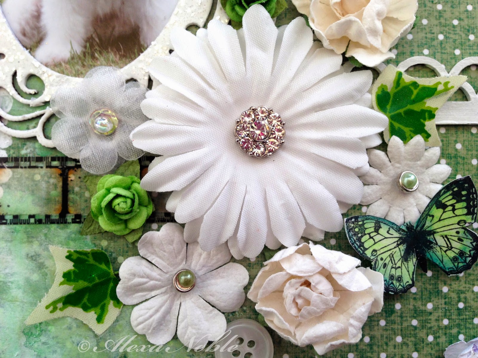
I clustered my blooms and added a little filmstrip and chipboard decorative strip for balance against the frame.  I used one of my special diamond brads on my main flower to tie in with the glittery frame.  The flowers are from a variety of manufacturers - I love Prima but they are not the cheapest so I always try to combine some less expensive options into the mix.  The little wired ivy leaves are really cost effective and add lovely colour and interest.


Thank you for stopping by ...

xx


Thursday, 9 January 2014

New Mask


Let me start by wishing you all a very Happy New Year!! I hope your weather is being kind or at least not as disastrous as it is for some poor souls.  Here on the South Coast of the UK we are being heavily lashed with floods, fallen trees and high winds.  Our beach has been moved by the wind and seas up onto the promenade and the sand is now so high that the wheelie bins have disappeared (so that must be over 4' high!!)

So onto our first challenge of 2014 for TioT which is very apt - 'In with the New'.   What this challenge is all about is showing something new - a technique, a new stash item or something Santa left if your stocking.  It's entirely up to you - how fun this that?!!  Just be sure to tell us what your new item is in your blog entry.

So what's new in my layout?  

I created this page using a masking technique.  I had the idea from this wallpaper which we recently used in a show home and I decided to recreate it on my page using a very low tack masking tape.  I used frog tape (available at Homebase and similar).  It's quite expensive compared to masking tape but I always find that masking tape damages the paper whereas Frog doesn't.


I started by creating my wood mask. 


The I painted the sections in with acrylic paints.   You need paints that dry matte for the best effect and these include many of the inexpensive brands (mine are Docraft Artiste paints).  Be sue to get a dark outline at the edge of each plank so that they are clearly separated once the tape is removed.


Once you have completed the whole sheet, remove the tape and put it back over the painted planks and do the same again for these areas.


Remove all the tape and voila! you have your scrapwood background paper.


I look forward to seeing your 'New' creations.  There is plenty of inspiration for this challenge from my other DT friends, so why not pop over to Try it on Tuesday Blog and see if you fancy joining in the fun?!

Take Care and Keep Safe.

X


Tuesday, 8 October 2013

Older & Wiser


I just love this cat - he's such a cool boy (all 14lbs of him!) - so I had to show him off with a page of his own!!

And the TioT challenge launched today is Textures!  Oh my goodness - this challenge was made for me as I LOVE textures of all sorts (I'm not fussy!!) Lumpy, bumpy, stripy, spotty, crackled or crazed - they are all my kinda thing!!

And, not only is this challenge super fun but there's a $10 prize for our winning entry to spend with Smeared Ink.  They have loads of great images to choose from and a rubber stamp club so it's a great prize if you get your textures rockin'!!

This layout was all about my lovely boy growing up.  He's a 8 years old and has put up with many changes throughout his years.  He has lost close companions and put up with unwelcome additions to our family and throughout he has always been a kind and tolerant boy.  With his size, he could easily hurt smaller pets, but he always takes the quiet option and simply observes or turns away from confrontation.  He is a King amongst cats and we respect him for his lovely nature.

So, onto the page ...

I used a doily on the side of the page for my first texture.  I painted it with gesso and them used molding paste and a circular stencil to create the panel for the baby photos. The frame stamp around the photos and in the top corner is by Prima.


I used gauze bandage, which is a great and inexpensive way to add fabric texture to a project, along the bottom of my page, which I painted with acrylic paint.  Small dots from a white paint pen, outlined in black, add more interest as do the few extra dots from the stencil.


I clustered up the lovely Prima blooms with a vintage watch face and a Prima metal plate.  The large flower was stamped and embossed in silver with some glass glitter in lavender added using glossy accents.  I finished the layout with funky fibres and a metal photo corner which I painted with white acrylic paint.


This layout was so much fun and came together without my usual angst (a rarity!)  I hope you get chance to pop by my other DT pals' creations as they are all inspirational.  So crack open your textures and get those creative juices flowing!  The $10 prize is only a texture away!!

Have a great week ...

x


Tuesday, 10 September 2013

Flowers


This fortnight we are concentrating on handmade flowers at TioT and the challenge is Make Your Own Flowers.

I love experimenting and I decided I wanted to make some loose blooms.  I used tissue paper and fine net to create these which remind me of those lovely dark fuschia blooms I had all summer in my tubs. If you crouch down and look up into the bloom, this is almost what you see!

I wanted to use the Fairy Rhymes stack by Prima as it's so lovely and I tasked myself to create a layout using the many elements that come in the stack 'kit'.  This is not something I normally do as I like to start with a blank canvas and create everything myself, so this was also something to add to my challenge.

I think this is why I love this crafting journey.

I hope you will feel inspired to join in with this challenge - why not try to do something outside your comfort zone?  Either way, I look forward to seeing all your lovely blooms ...

Have a great week

x


Tuesday, 2 July 2013

Moments Are Special


This fortnight, the challenge at Try it on Tuesday is to 'Show Us Your Metal'.  Another great subject as it's so open to interpretation and most of us have something metal in our stash.

My DT piece is a little different from the image on the site as I to confess that I have tweeked it a bit (not sure that's really allowed but needs must!!).  

I had the basic idea of what I wanted to do (which frankly is a rarity for me!!).  I made time last Friday to get myself organised so that I could attend my local crop run by David and Brenda of Craft Obsessions.  I had such a nice day with some really lovely ladies so I hope to try and become a regular attendee (it's my pesky kids & all their sports that get in my way LOL!!).

So, I got my photo blended into the paper and was very happy with how it all came together until I photographed it!!  Aaagh!! Due to the way cameras flatten your work and lose the dimension, coupled with the colours, my piece suddenly looked like Halloween had come early ...  not what I wanted at all.

Too late to change the upload but I decided the best option was to add some softer elements ie flowers to hopefully break the spell.  It definitely looks less halloweeny and I am happy with it as it doesn't have that look in real life.

I used a background paper from the Tim Holtz Lost & Found range and a main paper by 7 Dots Studio.  I dyed my lace using Dylusions sprays and arranged it to peep out around the edges and between the torn areas.  I used distress inks and paints on all the curled areas to highlight them.  The doorways were stamped with a Lost Coast stamp which I tried to line up a little with the background of my photo.  A few drizzles and drips of acrylic ink to add some interest and a bit of lace stamped in the corners finished stage one of my page.  


For stage two, I used light molding paste to blend my photo into the background with either smooth finish or with a brickwork mask.  Once dry, I dry-brushed acrylic paint over the areas until they blended in.

I created my bookplate from grey card which I painted with acrylic paints and rubbed in gilding wax to make it look like a patina.

I painted the lovely railings with acrylic ink and arranged the other elements around the page.

My metal elements are the key (tinted with black and blue alcohol inks), the clock face (caramel and lemonade alcohol inks used on this), a small cog from a pocket watch, the letter charms and the brads on the faux metal bookplate.

Pop over to have a look at some of the other metal projects the TioT Team have come up with and get inspired to delve some metal out from your stash and join in the fun!

Hope to see your take on this challenge.

Have a great week ...

X

Tuesday, 18 June 2013

Busy Bee


I created this page using a kit I was supplied with by Scrapbook Magazine.   I've never really gone for kits but I found that I really enjoyed using it as I had to focus on the best ways to use the various elements and how I could adapt them to suit my style.   For this project,  I was allowed to add other things but obviously the page needed to represent the kit so I tried to limit myself from a total stash raid!!

I added painted swirls to the backing paper and then heavily distressed the second paper using paints and inks and adding bits of vintage paper.


These lovely bees are by Lost Coast Designs.  They are a bit of a fiddle to cut out but worth the effort. I stamped them on vintage music paper before dipping them in beeswax - highly appropriate!


I used FlitterGlu and Copper Thunder gilding flakes with my honeycomb stamp to create their homes - lol!


I created my heart from some wired twine from the floristry wholesalers and added some acrylic paint to distress it.

The large letters are by Ten Second Studio which I embossed and painted with Stewart Gill paints.  The smaller letters are by Graphic 45 which are also embossed and distressed with paint.   

The pin and lace are from the kit.

I'm really pleased with the way this page came together as the colours really bring out the copper in Seb's hair and it's a rare shot of him standing and thinking and he's using running and darting!

I'm entering this page into the Creative Corner 'Recipe' Challenge - I used Lace, Metal and Paints.

Have a great week and thanks for popping by ...

X

Wednesday, 5 June 2013

WOYWW 209!


It's Wednesday already so time for another peep at my workspace.  If you are new to this weekly snoop, pop over to Julia's blog at Stamping Ground and you can see all the links to everyone's desk.  Then you can spend a nice evening hopping around the planet looking at what we are all up to!!  Fun!!

Have to say my workdesk has been rather boring of late - all work and no play is making this girl rather dull.   But not so dull when the pay hits my bank account - then it all seems worthwhile!!

Sadly my neighbour's wife died suddenly a couple of weeks ago and I have been trying to support him.  He is 91 and such an interesting man.  He was involved in the D-Day landings and many other wartime battles and we have had many interesting conversations about the war and loads of other topics over cups of tea and coffee and if I'm lucky, a "ginger doodle" on the side (a scrummy biscuit which he makes himself!).  It makes me sad that I never spent more time with him when his wife was alive.  She had alzheimers and so was not great company for him although he was absolutely devoted to her and they had been together for 70 years.  We have always had little chats over the fence but I could have got to know him better and enjoyed what we have now a lot sooner and helped to prevent times of loneliness for him.

Anyway, on to the desk ...

I have been completing a scrapbook page about my youngest son.  Well, despite being a triplet he is still the youngest by 1 minute!!  I was supplied with a kit (can't say too much about it as it's due for publication next month) which I had a free rein to use how I liked.  I made two pages for the magazine and let them select the one they wanted.  This one was sent back to I'm free to put it online.    I did a bit more fiddling with it, adding a bit more painty bits so later on I will put a post online showing the details.

Have a great Wednesday everyone - I've got to get back to work which is hard as the sun is shining and the beach hut is tempting me!! 

xx


Tuesday, 4 December 2012

Quarr Abbey


This is my first post as be DT member of the Try it on Tuesday blog - which is very exciting!  I have joined a fabulous group of talented ladies so be sure to go and take a look at some of the gorgeous creations they have made for this challenge. 

This fortnight is "Let's get Inky'!  What a great initial challenge for me as I always struggle not to get inky!!  The other bonus is that if you are not a Christmas crafter (and I am not!) this challenge is still right up your street.


We are sponsored this month by Delidious Doodles who are offering 4 digi stamps from their store - so don't miss you chance to be a winner!

I'm really excited to post this layout as I have been working hard on my techniques and style but am only just able to start posting my new creations ... so watch this space!!  One of things I really wanted to achieve was a more seamless end result and so I've been getting through a fair bit of molding paste and acrylic paint lately and taken over the house whilst they all dry out!

This photo is of the ruins of Quarr Abbey on the Isle of Wight which actually now forms part of a farmhouse garden.  There are great views over the ruined walls towards the mainland.

I used molding paste with a stencil to create the bricks and more paste and inks to blend out my photo.  I decided to be quite bold with my colour scheme by adding the pink but I really like the end result.  

I used acrylics and shimmerz inks for my background and added flourishes with a Lost Coast stamp.  The bird and branch is by Maya Road and the flowers and butterflies are Prima.

The sheep stamp is part of an Artemia farmyard set (that I had no use for but fell in love with!) from a little craft shop in Cornwall.

Hope you are all having a great week ... x


Wednesday, 28 November 2012

Pumpkin Carving


For those of you who regularly visit my blog this page will be a bit 'deja vue' and you are right, this is second time lucky for my pumpkin carving page!  


I've been working on creating blended layouts recently where my photos fall into the background so the page becomes like one big canvas rather than having elements layers onto the page.  It's quite a tricky and time consuming process but I love the end result.  However, in trying to do the same with these photos, I realised it is almost impossible with multiple photos with very different colour schemes.


So to cut a long story short, whilst I thought the end result was not the best I've achieved, I thought it did work ok.  However, the photograph exposed all it's weaknesses and when I asked my family for their honest feedback ... well it wasn't exactly great!!  So, I've dismantled it, binned it and removed the post (my mother always told me to leave my disasters in the kitchen so I'm metaphorically doing the same with that page!)

This layout is more along the traditional lines but it does work better on this occasion - I hope.  It's not so much fun scrapping the same photos twice and I'm ready to move along, so I'm off to see how my next blended creation is going to turn out!

Hope you are all having a creative week ... x


Friday, 16 November 2012

Watch the Birdy


What a hoot this was!!  

We visited Dimbola Lodge on the Isle of Wight whilst we were there on holiday this half term.  The Lodge is the home of Julia Margaret Cameron who was a photographer in the mid 1800's and whose portraiture was very influential at the time.

Aside from all the rooms of her images, there is a dressing up room and once we got started, we couldn't stop and ended up spending over an hour in there perfecting our Edwardian poses for the camera! 

The lighting was shocking so all the photos needed a lot of work in Photoshop but I'm pleased with the end result.

This layout is based on an old draughts board.  I taped areas using masking tape before giving it a light coating of Gesso and then one of copper Steward Gill paint.  Once both layers were dry, I stamped the filmstrip, butterflies and peacock feathers onto the board using Staz-on and arranged the cleudo cards and 'murder cards' pocket onto one corner.  I added a little blue glitter stickle to the eye of each feather.

The grungy panel was added using Matt Medium and a combination of 2 embossing powders - Tattered Rose Distress and Silver Fox Enamelz.  (It's not as shiny in real life - but it picked up my daylight lamp - evening photography has its drawbacks!)

The vintage image behind our photograph is from a book of old black and white photographs.  It is translucent so that the board can still be seen behind it and this was achieved using transfer glaze.  

The flower braid is by Tim Holtz and was spritzed with Shimmerz and the circles were cut using the washer board alterations die.

The stopwatch was created with black UTEE poured onto a La Blanche stamp (which I killed in the process - ooops!) Once dry I applied gold metallic rub-on to highlight the detail.

I cut the bird from balsa wood using a sizzix die which I then spritzed, applied silver gilding paste and a swirl stamp.

I inked and stamped a small tag to go in the murder cards pocket, detailing the date and location of the photograph, fixed down the draughts pieces and film strip and completed my layout with Tim Holtz Alphaparts letters for the title.

I hope you like the end result and our rather sober expressions and ridiculous outfits bring a smile to your face! x


Thursday, 15 November 2012

Leave only Footsteps


Who can resist the beach?  This natural arch is at Perranporth beach in Cornwall and makes such a gorgeous frame it was crying out to be photographed and scrapped!

There were so many processes with this page that I wont try to itemise them all but it started with a collage of vintage papers and music which I then inked and stamped.  I created the large glossy grungy panel using matt medium and embossing powers. 

I had intended to create a line of white footprints across the page but due to not having an iron with me at the weekend, this was hard to achieve with a heat gun.  I've managed to create a couple but that's always the downside of being away from your own desk!!

The photos were torn and inked or dipped in sand from my local beach.  The gorgeous wooden embellishment was sprayed with Shimmerz inks and the playing card had paper transferred to it with matt medium and then tinted with alcohol ink.

The alphabet is by Darkroom Door which I cut, inked and mounted using dimensional gel.

Have a crafty day and thanks for stopping by ... x


Wednesday, 14 November 2012

Snakes & Ladders


I purchased a 1950's snakes & ladders board and used this as the base for my layout.  The photos of the children having fun on a long slide were perfect for this project.  I covered the board with Tim Holtz music tissue tape which I crumpled up to give a great textured background.  Once this was dry, I painted it with Steward Gill paints which give a lovely subtle sheen.

I inked up two plain tags with distress ink and then hit the Frantage again (I can't resist it!!).  This time I used a combination of silver and Pearlized mica fragments.  The chance card is from an old monopoly set which I stamped and inked and the card behind is actually the 10 of clubs which I lightly painted and rubbed off before inking with black soot
.  The third tag was inked and stamped and then silver embossed around the edge.

I wrote the sentiment in an italic style onto strips of cream cardstock which I tore and inked.   A couple of strips of tissue tape and a few metal embellishments, including a lovely glass bead which I attached to a vintage brass chain completed the layout.

I hope you like it! 

Have a great day and keep an eye out for those slippery snakes!! x

Corrugated Page


I'm just back from a lovely scrapbooking weekend in Devon. I love the creative atmosphere that is generated when people all come together, as my art is usually such a solitary activity.  I also cherish being able to craft for as long as you want without having to stop and make meals or do the laundry!!  What a luxury!

We were concentrating on using game pieces and so this layout features large jigsaw pieces.  I used these pieces to link into the photos I had taken of two of my boys who often fall into step together when we are out for family walks.

I started by using acrylic paints on my card and then I used shabby ivory embossing enamel on the opposite corners and embedded  Frantage gilded micra fragments whilst it was still hot.

The jigsaw pieces were covered with old dictionary paper and an old map which I then distressed and stamped onto.  The boys' initials were cut from a vintage pictorial alphabet book.  The little metal number was tinted with pesto acohol ink, as was the small sprocket.

I stamped the sentiment using individual alphabet stamps from 4 different packs onto some Kraft Resist paper which I then distressed with Shabby Shutters.  A few more cogs and sprockets and one of Prima's gorgeous lightbulbs completed the layout.

Hope you are having a good week ... thanks for stopping by! x


Thursday, 6 September 2012

Seashells


We visited Lulworth Cove recently and took a clifftop walk.  The weather was perfect for walking and the views of Durdle Door were breathtaking.  

After the walk we strolled to Lulworth beach and bought some fresh fish from the little shop that sells some of the local catch.  I took this photo as we looked back up the lane through the village.

I created the background paper by layering and painting old sheet music and book pages which I then stamped and inked.

The filmstrip is an alterations die which I have cut from co-ordinations paper and sanded back heavily and added picket fence distress stain.  I used a paint colour selector card which I stamped with different mini stamps all by The English Stamp Company.

The street lamp is by Dusty Attic and the butterfly is by Lost Coast Designs.  The cottages are by Crafty Individuals.

Keep smiling ... the sun's out at last!!

x


Sunday, 5 August 2012

Butterfly Canvas


I recently got a card through to door to collect a parcel from the local sorting office.  I was mystified as to what is was as I hadn't ordered anything that I could remember.  So, what a lovely surprise it was to collect the parcel and find it was a top which my Mum had bought for me as a treat!  It has purple and mauve butterflies diagonally across the front with little silver studs in between and is gorgeous.

I wanted to make something to thank her and use the butterfly theme.  I started by making the large alterations butterfly with acetate behind the wings which I coloured with alcohol inks.  I then used distress stains to create my background and I added distress inks to increase the colour on various parts. 

The butterfly border is another Tim Holtz die which I cut from some of his District Market paper and coloured with Mica Powders so they shimmer subtly on top of the background writing.  The large swirl stamp and the seed head stamp is by Donna Downey.

The doily was spritzed with glimmer mists and very carefully allowed to dry as doilies fall apart very easily once sprayed!  

The photograph is of the children and is printed out onto canvass and the journalling is printed onto cardstock which I tinted with inks.  The journalling reads: 

It's not just Butterflies that Emerge in New Forms, 
Children MetamorphoseRight in Front of Your Eeyes, 
Chaning into Young Adults with their own Thoughts and Opinions, 
Something that is Truly Amazing.  
It's the Best Journey to be a Part of.

I bought a canvas and painted the edges to match my project with acrylic paints.  I stamped butterflies on all the edges and used Tissue Tape for added interest.  Once dry, I fixed the project to the canvas.

I hope Mum likes it as I was pleased with the end result.


Sunset


I have had this layout half finished on my desk since May! 

I started it during the scrapping weekend I went on in Cornwall and due to the building work and now school holidays, it has been waiting to be completed ever since - oh dear!

The background was created with moulding paste and stencils and stamps which I then painted with Stewart Gill paints when it was dry.

I used some Fresco Flakes (Stewart Gill) for added dimension.

The journalling is created on painted masking tape.

The photo was taken during out holiday in Phuket in April - Thailand certainly gets some of the best sunsets ...


Tuesday, 15 May 2012

You Fly, You Soar


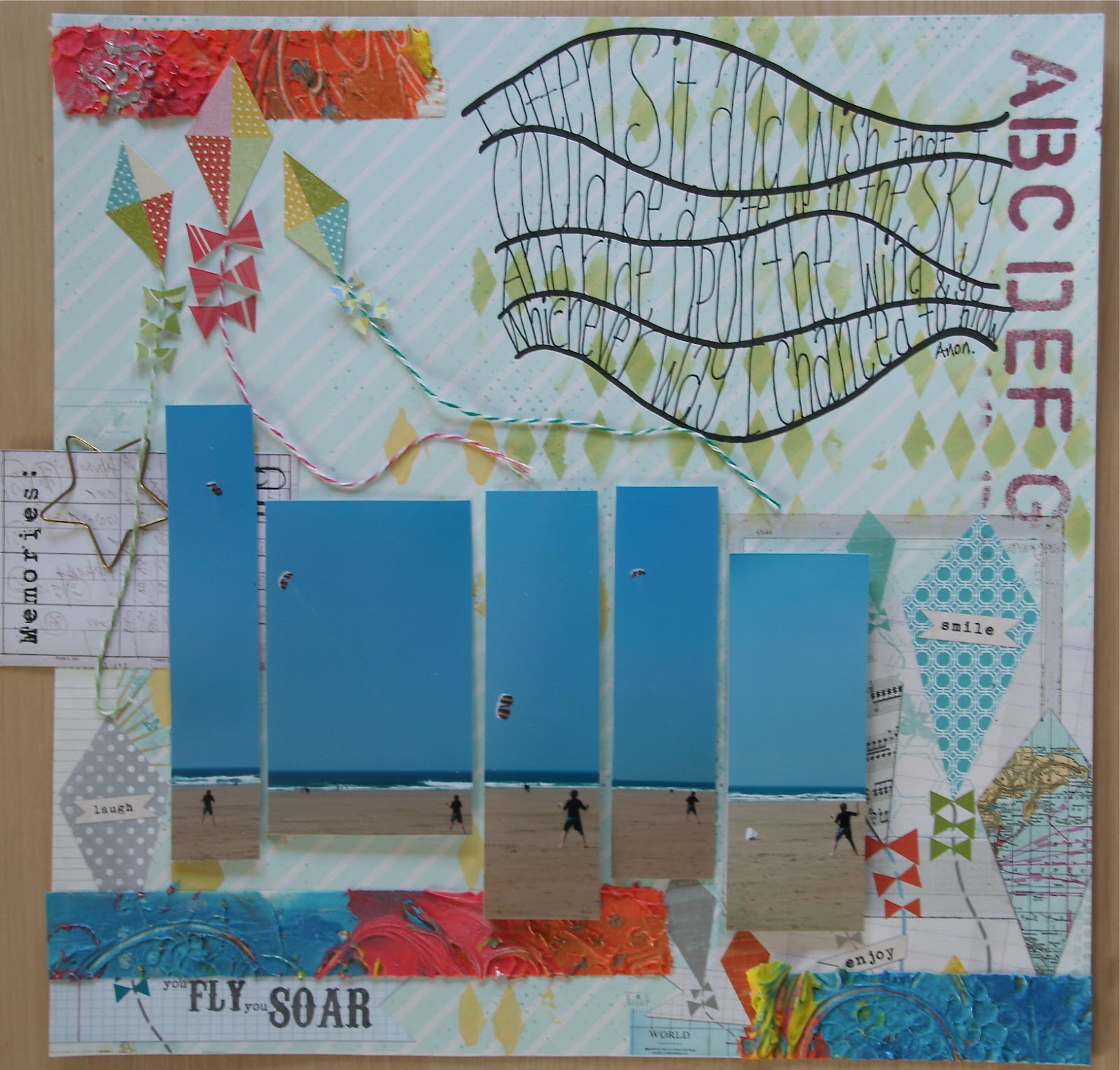
I didn't get this layout completed over the weekend as I struggled with getting it to come together.  It's funny -  I knew I was going to do a layout about kites so when I saw this paper in the shop, it seemed really perfect.  But in reality, I find papers with elements already included quite hard to cope with as I don't want to cover those parts of the sheet so it restricts my layout choices.  I definitely prefer a blank canvas and creating my own background so I can be free to place things wherever I want.  (Note to Self:  do not buy this kind of paper again!!)

I used acylic paint and a harlequin stencil to add interest and also an alphabet stencil using glimmer mist.

The kites were from a sheet which matched the paper so I added candy stripe string tails and cut little bows.


The photos of my son flying his kit were cut into different sized strips and mounted using 3D silicone glue to vary the depth. 


The new technique I used on this page was making the bright texture strips.  These were made using molding paste (Golden) which I coloured with acrylic paint and applied using various tools onto strips of masking tape.  When they dried, a rubbed them with several shades of Inka Gold.  

These strips are great as you can tear them to what ever length you want and add them to your page.  Mine are very bold but you can make them using plain molding paste which you can paint to match your scheme as you use them.  I stuck mine to a plastic box lid as it makes them very easy to remove when you want to use them.


I found the poem on a poetry website and journalled it between some wavy lines to finish the page off.


Play


Everyone loves dandelions clocks as they are just irrestible - sitting in meadows with their large fluffy heads arranged in a perfect ball just waiting to be picked and blown into the wind!


I took this photo last year and love the way I managed to capture the individual seeds blowing in the breeze.


This page was created using tissue, lace, old music, old napkins and stamps all fused together with bondaweb.  I made a large panel and as it had several layers, I did need to use some gel medium to fix some of the elements together.  I stamped butterflies and alium heads randomly onto my panel and added a little tissue tape here and there.


Once it was all dry, I stitched is using metallic thread in the sewing machine onto my background paper.  Metallic thread is gorgeous but can be a bit of a challenge to sew with due to the metal elements in the thread so be warned - you need patience!!


I used a zig-zag thread pattern and I held the paper still in the machine at some points to create more interest in the stitching.


I layered my photo onto a page from an old children's book and popped a small doily behind before added a large prima diamond and pearl embellishment.  I extended the embellishment by cutting sections from another diamond swirl so it covered most of the page height.


I grouped my old clock face and fairy girl in one corner with my sentiment, and the layout was finished. 

x


The Lost Gardens of Heligan


On the way down to St Ives, I met with my good friend Sue in St Agnes to drop into the one and only scrapbook shop that exists in Cornwall (sorry Linda - we did pop in!!)

Anyway, I bought this paper which is actually black and white and which reminded me of the blooms in this photo.  I had intended to use the paper 'bare' as it were, with just black and white additions but as you can see, this didn't really end up happening and I actually prefer it now!

I started by creating a black and white panel consisting of torn music tissue, lace, old music sheets and book pages and old sewing pattern tissue which I stamped with a large alium stamp.  I bonded all of this together using bondaweb and a hot iron on greaseproof paper.

I painted the edge of a couple of small doilies with Byzantia paint in Cerisanctum pink and then stuck them and the black and white panel across the centre of my page. 

Using leftoever strips of bondaweb, I adhered the rainbow voile to my page and using silver and violet stickles, I highlighted some of the areas on the top of the layout.


The textured panel was created using  a texture stamp (lisa pavelka) and light molding paste (Golden).  As these take 3 days to fully dry, Linda (Just Scrapbooking) had very kindly made some panels for us to use.  I painted my panel with Byzantia paint and then sewed some seed beads onto the edge.  The gorgeous metal embellishment is by Prima from their Vintage Trinkets range.


I used lace and braid down the centre of my page and created my journalling on my lovely old pink Royal typewriter.  The gardener's note is a fact I chanced upon when I was checking whether my bloom was a chive or an alium!  I haven't ever used the flowers although I have got this plant in my garden so next time I make a potato salad, I'm going to put these flowers on top as they will look amazing!

Using the bondaweb to make background panels was a new technique, as was the use of fine gauzy material place over all or some of a layout.  Both are great things to try and are attributed to Linda for teaching them to me - thank you!!

x