Hi Everyone! Not sure how many people will read these latest posts as I'm sure a lot of you have given up on me posting any new projects but here goes anyway!!
I am really pleased with how this page cam together and even more pleased that Scrapbook Magazine decided to use it on their front cover! That certainly brought a big smile to my face! I've yet to make the main image on the cover ... but that gives me something to aim for.
 This project features Dekromounts which are really sturdy mounds for card and scrapbook pages. They are plain cream and can be sanded, painted, embossed, inked etc and so are good fun to work with. I was given a kit by Scrapbook Magazine and so for this layout it gently inked the edges in victorian velvet DI and them mounted it onto the corresponding back plate which I had covered with Autumn Gold gilding flakes.
I stitched some of the other papers in the kit to my background before using white acrylic paint and a Tim Holtz burlap stencil to add texture. I added some greens and pinks using gelatoes which I blended with my finger to finish the background.
I filled a small bottle with some same and small shells before adding my message in a bottle, tied with natural twine.
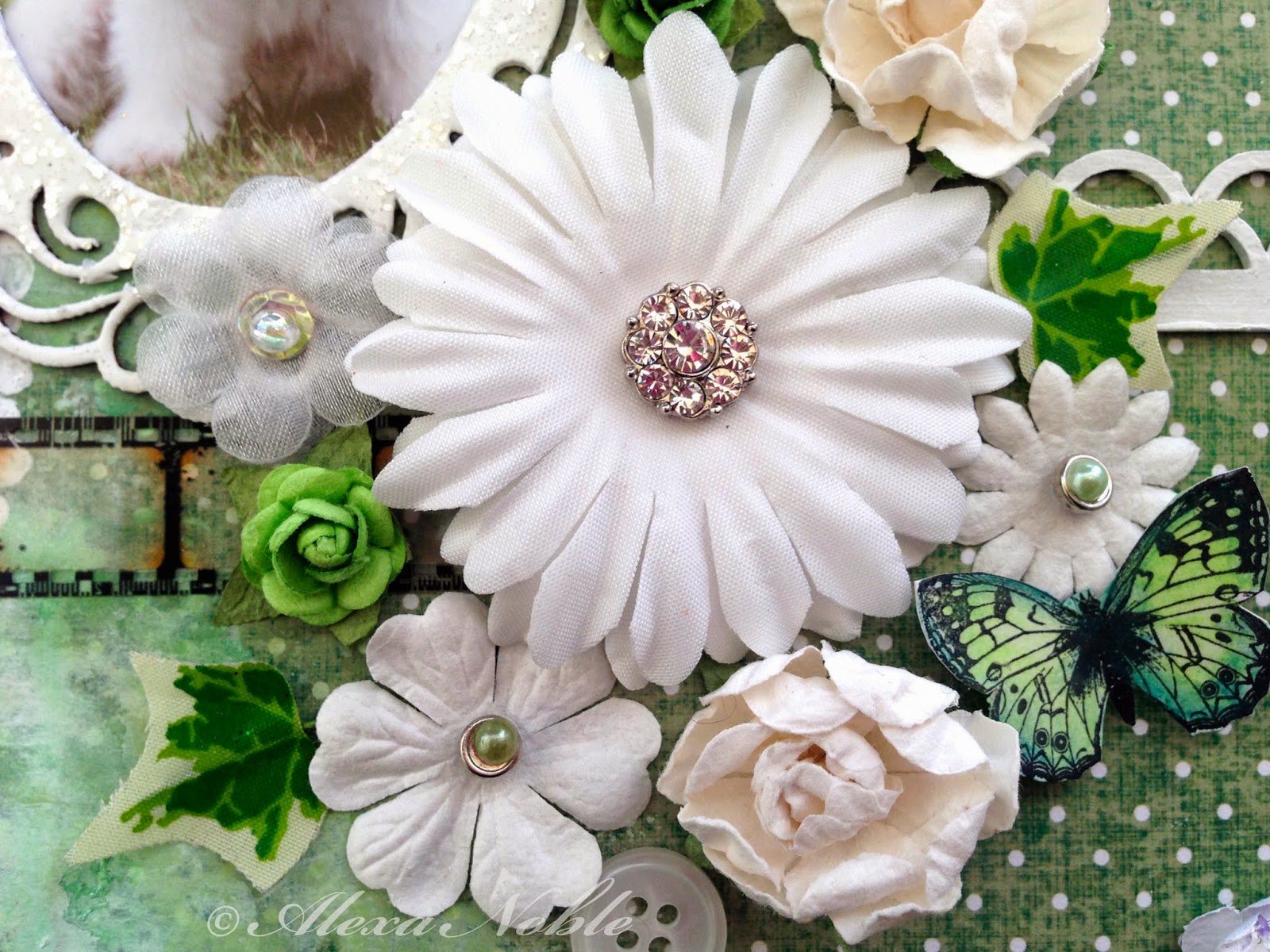
I love prima flowers as they alway sit so well on the page and their colours are always beautiful. I used them, coupled with some Petallo plains to frame my bottle, along with curly wire stems for my blooms.

I inked up the beach day checklist to match my layout and created my postcard stamps and ink. The journalling was created using my lovely pink typewriter (which makes me smile ever time I get it out).
The text reads:
After the storm subsides and the waves no longer crash onto the beach
Treasures of the deep which are normally hidden, lie uncovered on the sand.
A spiral castle of green, pink and gold gleams in the white foam
I capture it's beauty before returning it to the depths of the ocean where it belongs.
The story behind the photo is that I was walking on the beach in the winter sunshine on the day after the big storms we had this winter. I saw this beautiful shell sat on the edge of the sand where the water was lapping. Most of these type of shells on the beach are just plain cream in colour as they are empty but this one still had the animal inside and the colours on it were just amazing. I would love to have a shell like this in my collection, but I have to wait to find one which is empty.
This lovely metal starfish has been in my stash for ages as I can't replace it and it's so realistic. I thought this project justified using it and so it now sits proudly on display rather than hiding in my drawer.
Thank you for visiting today ...
xx

 I added the Damask textures with a stencil and molding paste to which I then added some fabric in the edge and plenty of paints and inks, splats and more stencilling.
 The title was hand cut, as were the butterflies which are by Lost Coast Designs.